Simple Stay
A hotel booking platform

Challenge
Many existing booking sites feel overwhelming, with cluttered layouts and confusing filter systems.
My challenge was to create a clear, intuitive flow that supported how users actually browse: searching, filtering, and applying preferences with minimal friction.
Client
UXDI Dublin
Tools
Figma
Role
UX/UI Designer
Duration
2 months
Solution

The goal of this project was to design a hotel booking platform that made it simple for travelers to search, filter, and book accommodations.
I focused on mapping out the most-traveled user flow—the journey from landing on the site to booking a room.
Web design + Booking accommodation
Visual Hierarchy
I prioritized a layout that draws attention to the search results while keeping filters accessible but unobtrusive. The design balances utility with visual clarity, ensuring that the booking process feels easy rather than overwhelming.

Filter Menus
I designed the filters as separate, reusable components in Figma to keep the system modular and consistent. A key focus was the “Popular Filters” dropdown and the “Apply” button interaction. I simplified these so users could easily select preferences and apply changes without getting lost in the interface.
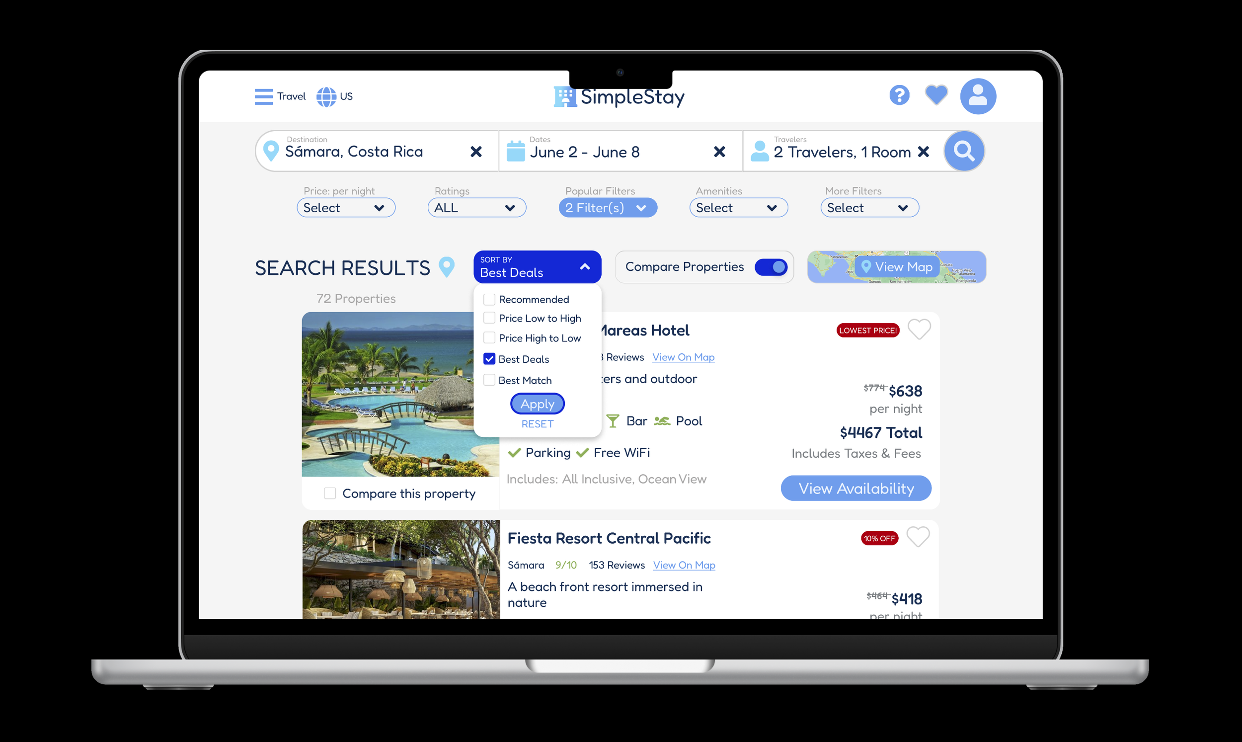
Prototyping & Iteration
In testing the prototype, I caught issues with how the dropdown and “Apply” button behaved. Iterating on these interactions helped me refine the design so the flow felt smooth and predictable—mirroring how users expect filters to work on real booking platforms.

The final design achieved a booking experience that:
Supported user patterns
Focusing on the most-traveled flow ensured that the core journey—searching, filtering, and booking—was intuitive and efficient.
Streamlined filtering
Filters are quick to use and modular, giving users confidence in refining their search. Improved “Popular Filters” and “Apply” button behaviors made the prototype feel closer to a live product.
Set the stage for scalability
Component-based filter menus allow the design to grow with more features without losing consistency.
This project was a study in both interaction design and flow optimization, teaching me the importance of prototyping not just for visuals, but for catching usability issues early.
the Full Experience
Looking back on this project a few years later, I see an early web designer learning the ropes. At the time, I was focused on making things functional, solving for filters and flows, and just getting the prototype to work. With more experience now, I can clearly see areas where the design could be cleaner, more mature, and better aligned with modern UX practices.
It’s been encouraging to recognize how far I’ve come as a designer. This project is a snapshot of where I started, and it would be exciting to revisit it as a full redesign, applying my current skills to create a more polished, scalable, and user-centered booking experience.